Friday, September 8, 2017

Things with feathers

I’ve been painting birds off and on for many years. It’s an intermittent pursuit, and I’ve been met with resistance from galleries at times. “But,” they have said, “you are not ‘known’ for bird paintings.” Interesting how easily one can become a product instead of a painter. I would like to think I am just a painter, not a painter of ______. I choose subject matter because it is available, interesting, inspiring, and challenging.

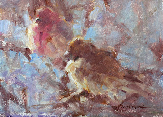
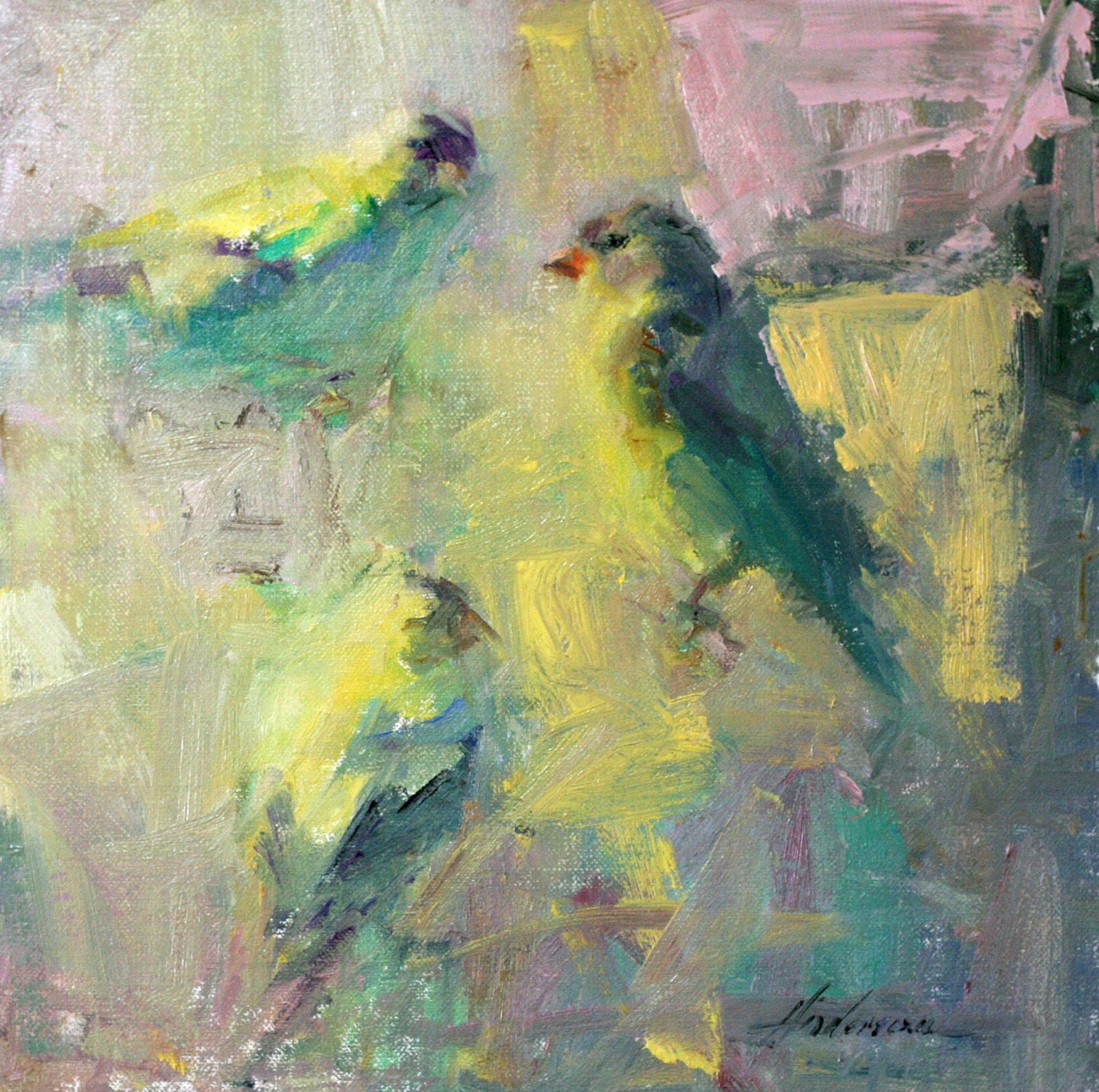
With any subject, I initially try and decide what it is I don’t want my painting to look like. This makes the most sense to me. A painting is a possibility, good, bad, or mediocre. It is similar to a new day, somewhat constrained by routine and necessity, but open to whatever may transpire. So, from past experience and personal preference, I decide what to try and avoid.

Things to avoid in my paintings of birds:


1. The dead bird look (unless, of course, a dead bird is the subject).
2. The taxidermy bird look (similar to dead birds, frozen in time and lacking any sense of movement).
3. Painting an illustration for a bird identification book.
I am not an ornithologist. I do not need exact measurements and exquisitely detailed plumage. My painting should not be an Audubon print or a duck stamp. I am not Roger Tory Peterson, whom I hold in high regard for his exquisite drawings in the Peterson Field Guides.


What I would like in my painting:


I want complexity and simplicity. I would like to find the rhythm and pattern that is universal, but is also as individual as a single bird. I want the snowstorm and the snowflake.


Interesting and enlightening book:
"The Thing With Feathers" by Noah Strycker
The surprising lives of birds and what they reveal about being human. 

Friday, May 19, 2017

Stripey things, zebras, and the uncanny valley

Stripes and zebras
Stripes can mess with your brain. A recent study from research in the Netherlands and the U.S. suggests that “looking at intensely stripey things causes an increase in gamma oscillations in the brain” which can be linked to headaches and seizures. Many people just find stripes weird, but some experience very real visual distortions. What is even more interesting is that these effects are more likely to be caused by human-created stripes such as venetian blinds, rather than natural stripes, like those found on zebras. Researchers found that distorting the lines slightly or blurring their edges caused the oscillations to die down. And vertical stripes are not as disturbing as horizontal ones. “It seems that our brains are not designed to cope with such extreme regularity, as it doesn’t occur in nature.”

The Uncanny Valley
Natural realism and artificial realism are also the basis for ongoing research into an odd property of computer generation called “uncanny valley”. The closer the images get to total realism the more disturbing they seem to become. Japanese robotics engineer Mashahiro Mori coined the term in a paper he wrote in 1970 titled The Uncanny Valley. He proposed that we will accept a synthetic human that looks and moves realistically, but only up to a point. Once the resemblance comes close to, but not close enough to reality, we become more and more disturbed by slight anomalies. Mori’s theory made its way into computer animation. Stylized cartoons engender empathy but pseudo-human characteristics can easily go awry.

"Uncanny valley really does relate to painting! The closer the work gets to being
realistic the more cognitive dissonance is triggered. This causes a person to feel really uncomfortable, so the mind jettisons whatever is causing the dissonance." 
 Kathryn Fisher, Artist

When the first computer-generated elements began turning up in Hollywood films, technicians were capable of making things like dinosaurs, metal men, and spaceships, but creating a realistic human, with all its variety and subtle changes, seemed unattainable. The outward appearance of a human or human face could be created, but all the variables present in reality, especially having to do with subtle movement, were more difficult to achieve. Even slight imperfections in humans can create unsettling reactions in viewers. The closer to reality an animation becomes, the more likely it is to create cognitive dissonance and a sense of discomfort and conflict in the viewer.

We pay attention when something is changed,
 or different, or just seems weird.

Seeing is dependent on noticing and we notice only when we look for something. We cannot notice everything, but we do pay attention when something is changed, or different, or just seems weird. The process of visual observation is a complex one. We notice the most obvious information and tend to overlook all the nuanced information that actually underlies our perception.


Leonardo da Vinci’s painting Mona Lisa is probably the most iconic painting in the world. We also know how this painting “looks”. But art historian E. H. Gombrich pointed out how difficult it is to look at this painting with fresh eyes. He urged viewers to look anew, to try and forget what we think we know and focus on what we truly see. “She really seems to change before our eyes and to look a little different every time we come back to her.”

Neurobiologist Margaret Livingstone, author of Vision and Art, did just that. She looked anew at the painting and noticed the expression on Mona Lisa’s face was dependent on the discrepancy between our peripheral and central vision systems. The center of our gaze is optimized for small, detailed things, while our peripheral vision has a lower resolution and is better at big “blurry” things. We are usually not aware of this difference because we are constantly moving our eyes around, and we do not notice that our peripheral vision (blurry) can be just as important as our central vision (detail). If you move your eyes around the painting, her expression appears to change. Look directly at her mouth and she appears to smile less than when you’re staring at her eyes. Our peripheral vision picks up the slight shading around the mouth which gives the impression of a smile. When your gaze falls on the background or on her hands, this effect can be even more pronounced. 
(Livingstone notes this observation is more apparent when viewing the original painting instead of a reproduction.)

More stripes, more zebras
Dazzle camouflage was a type of ship camouflage used extensively in World War I and to a lesser extent in World War II. British marine artist Norman Wilkinson is usually credited as being the father of dazzle camouflage but this is not entirely accurate. The idea was initially proposed by the British zoologist John Graham Kerr. In writing to Winston Churchill in 1914 he explained the goal was to confuse, not to conceal, by disrupting a ship's outline. Kerr made the comparison to the patterns on land animals such as the zebra and suggested a similar pattern but with the use of countershading to also offer a measure of invisibility.


American artist Abbott Handerson Thayer wrote to Churchill in 1915 and suggested disruptive coloration and countershading based on his 1909 book Concealing-Coloration in the Animal Kingdom. Neither Thayer nor Kerr were able to win over the Admiralty, but along came Norman Wilkinson, a marine artist and Royal Naval Volunteer Reserve officer. He advocated "masses of strongly contrasted colour" to confuse the enemy about a ship's size, speed and heading. He also said the effect was not to conceal, but to cause the enemy to take up a poor firing position.  Kerr, whose proposal was based on years of study, lost out to the more socially connected Wilkerson. Later, Kerr was asked if he had, in fact, invented dazzle camouflage and he replied by saying "this principle was, of course, invented by nature."
Thanks to Artist Amber Blazina for this interesting tip on dazzle camouflage.


And for those of you who have read this far, here's a diagrammed selection from John Singer Sargent's painting The Daughters of Edward Boit. Any figure or any "thing" we paint needs a variety of edges, most notably from side to side. Too many similar or hard edges, especially on a horizontal plane, can negate our attempts at creating the illusion of three dimensions. I have illustrated a few obvious points of reference and also included some diagonals to illustrate the flow of information and the variety of edges.
Suggestion: Try squinting at the image to see value contrast more easily, and keep in mind edge information can be enhanced by value similarities or value differences between the object and the area around the object.


Friday, March 31, 2017

Making canvas panels - the easy way

The easiest and least expensive way to make panels is to use a Masonite or Gatorboard substrate and apply a sealer to the surface. Liquitex acrylic gesso provides an excellent surface without too much absorption. Note: Use the professional or standard Liquitex, not the Basics Liquitex. Three coats applied with a small foam roller works great. (Two coats on a white surface can be sufficient.) But if you want an easy and fast way to make canvas panels, here are a few tricks.

You will need the following: an iron, your choice of canvas, Gator Board or another substrate like Masonite, a heat-activated adhesive such as Raphael’s Miracle Muck, a lightweight cloth, and a paper-creasing block or tool, often called a bone folder. You will also need a brush or roller to apply the adhesive.A good source for Gator Board is Artgrafix. The Natural Kraft Gator Board works best and I often order 18x24 boards. This is an easy size to store and work with and panels can be cut as needed. The 18x24 size is not listed on their website, but you can call the company to order it. The 3/16" thickness works for this size if you are cutting the panels down, but if you work very large, use the 1/2" thick boards.  

If you have ever worked with a roll of canvas, you know one of the biggest problems is the curl in the canvas which makes it difficult to lay it flat and also difficult to adhere to the panel surface, which is usually done by rolling with a brayer. This is where the best trick of all comes in – use an iron.

1. First of all, cut your canvas to size. I add a half-inch to both width and height. Since I frequently use the 18x24” Gatorboard panels, I’ll cut my canvas to 18½ by 24½. Set your iron to a medium to medium high heat setting and iron the backside (unprimed) side of the canvas. You now have perfectly flat pieces of canvas. (I use Claussens oil-primed canvas, usually #66.) When you are done, turn the heat setting on the iron down to a little less than medium or less than half-way.


2. Apply a coat of adhesive to one side of your panel. The best and fastest way is to use a foam roller. You need an adhesive that is heat reactivated. Raphael’s Miracle Muck works great.  Raphaels.com Miracle Muck  


3. Lay your canvas face down (primed side down) and carefully align the panel to the canvas, allowing some of the canvas to extend past the edges of the panel.
Flip the canvas panel over and place a lightweight cloth on the primed surface of the canvas. Flour sack cloth works great, but any lightweight cloth will work. You just need something between the primed surface of the canvas and the iron. (Trust me, I learned this the hard way.)

4. With the iron turned down to a little less than halfway, iron the face of the panel, starting in the middle and working out. Do not over-iron. Three to five passes is usually sufficient. Avoid getting the canvas too hot. This is a fast process and so much easier than using a brayer/roller. Remove the cloth.


5.Take a smooth block of wood or a tool called a bone folder (used to crease paper) and firmly crease all the outside edges of the panel and also press down on the outside edges. (A sanding block should also work.) This step is critical for making sure the canvas adheres well on the edges and does not pull up from the sides or corners as the adhesive dries. Bone Folder.com - square bone folder

This wood block works great but not sure where to find another.

6. Stack the panels up and weight them down for a day. Trim the excess canvas from the sides and you should now have perfect canvas panels, ready to be used as is, or cut to any size.

Additional tips and tricks: Gator Board can be scored and cut with a utility knife. It will take several passes to get a good cut, but is easy to do. I quit rinsing out the roller tray to keep excess adhesive from going down the drains. I just put any extra adhesive back in the bottle and let what remains dry in the tray. I do wash out the roller but make sure to use some soap. I also keep brown paper on my framing table which can be easily replaced as necessary. No work table - no problem - just use newspaper or something. Years ago when I made most of my frames and did not have a separate work space, I did most of the finishing work in my kitchen. I just made sure to cover all the surfaces with plastic. As the saying goes - whatever works . . .


Wednesday, February 15, 2017

Rational control and intuitive flow

Summary: Painting is a combination of chess and making breakfast. Combining the two requires some dancing. Robots can’t dance. And the next time you’re in front of your easel, try actually listening to your painting instead of always talking over it. Feedback and response is a good thing. 

Robert Genn (1936-2014) was a well-known Canadian painter and author of the Painter's Keys web site which he started in 1998. The site mails out a twice-weekly newsletter, and is currently run by Robert’s daughter Sara. You can sign up for free at The Painter's Keys. Following is an excerpt from a letter titled “The Intuitive Flow” originally published by Robert Genn on February 11, 2000.

“To what degree do we pay attention to our progress and to what degree do we just let it flow? My observation has been that there are times to give thought and other times when thought may be dangerous. Most of us have noticed how too much thinking can lead to poor or contrived work. Many of my outright failures have occurred when I wanted so badly to succeed, brought every brain cell to bear and fell down miserably. It makes you realize that something other than the cerebral cortex is necessary. Consider the centipede. If this lowly being paused for only a moment to determine which foot to move forward next, it would undoubtedly stumble. The centipede has rhythm and flow in its hundred legs precisely because it does not have to think about it. Consider this the next time you move the instruments of your art. At what point in the act of art does a natural power or a mysterious intuition seem to guide and generate excellence?

"Among the artists I know, admire and compete with, I've noticed the following: They understand the basics. They train themselves. They perfect the details and trivialities of what they do. They master their stances and their strategies. Then they put their heads down, close out the crowd and let it flow.

"Balancing your calculating brain and your intuitive flow is an easy dream and a difficult task. I think it's one of the true miracles.” (Robert Genn)

In September of 2016 Uri Bram posted an article titled “The Limits of Formal Learning, or Why Robots Can’t Dance.” He interviewed David Chapman, one of the first researchers to apply the mathematics of computational complexity theory to robot planning. Chapman suggested AI researchers address the challenge of teaching a robot to dance. “Dancing,” Chapman said, “was an important model because there’s no goal to be achieved. You can’t win or lose. It’s not a problem to be solved… Dancing is paradigmatically a process of interaction.”

Since most AI research revolves around task-oriented problems, ones with definite goals and a rigid structure, teaching a robot to dance would present unique problems. Chapman emphasized development over learning. Learning implies completion while development is an “ongoing, open-ended process. There is no final exam in dancing, after which you stop learning.”

One could argue the successful use of formal reasoning in areas such as science, engineering and mathematics has placed too much emphasis on logic-based, linear thinking and overlooked all the information being processed and working in the background. As the German philosopher Martin Heidegger pointed out, routine practical activities, such as making breakfast, are skills that do not seem to involve formal rationality. Our ability to engage in formal reasoning seems more likely to rely on our ability to engage in practical, informal, and embodied activities. He suggested most of life is unlike chess, and more like breakfast.

Heidegger’s observation on chess and breakfast is similar to Annie Dillard’s explanation of the mind/body  dilemma.  “The mind wants to live forever, or to learn a very good reason why not. The mind wants the world to return its love, or its awareness; the mind wants to know all the world, and all eternity, even God. The mind’s sidekick, however, will settle for two eggs over easy. The dear, stupid body is as easily satisfied as a spaniel. And, incredibly, the simple spaniel can lure the brawling mind to its dish. It is everlastingly funny that the proud, metaphysically ambitious, clamoring mind will hush if you give it an egg.”

Somewhere between chess and breakfast, the innate movements of the centipede Genn mentioned and Chapman’s robot is a place where it is possible to exceed our own expectations.

In the book “The Wayward Gate” Philip Slater  wrote, "Imagine life as a complicated dance. When we're thoroughly "into" the dance we don't have to analyze it in order to participate in a creative and harmonious way, no matter how rapid and intricate it becomes. But occasionally we're distracted, get self-conscious, lose confidence, trip, collide with someone, get out of synchrony with the rest. At such times we may mentally step out of the situation, look around, and try to figure out where the dance is going and where we fit in. Like children jumping rope, we adjust our timing for a few turns and then, when we're back in tune, leap in and again relinquish rational control in favor of a more instinctive kind of coordination.”

Slater went on to say rational control is a necessary device and useful for restoring balance, but destructive when we become dependent on the illusion of control. “I said rational control was a way of getting back in the dance when we’d lost our footing. But sometimes we get dazzled by the intricacy of the dance and forget about getting back in.” The need to understand the whole dance, not just our part in it, leads us to want control, to “reproduce it, mechanize it, and make sure we never lose our place again."

"My wish to understand . . . comes from my particular place in the dance – nine thousand and thirty-third whirler from the left, spinning on one of those bumpy places that make people lurch every so often. Lurching gives me a desire to grasp that the dance as a whole doesn’t share. The most grandiose, ‘objective’ theory in the world, in other words, is just a complicated personal effort to find one’s own place in the dance.  . . . Of course, from another point of view even lurching is just part of the dance, and so is stepping outside the dance, and so is trying to analyze and control the dance . . . They’re all just dances . . . and you’re just dancing.”


Thursday, January 19, 2017

Fractals, chaos and Mancini's graticola


In 1999 physicist Richard Taylor claimed Jackson Pollock’s drip paintings were not just splattered paint, but excellent examples of fractal patterns. His research even led him to construct a “Pollockizer,” a container suspended on a string that would fling paint onto a canvas. The Pollockizer could be adjusted to fling paint in either a chaotic or a regular pattern creating either fractal or nonfractal patterns. Taylor was so confident of his method of categorizing Pollock paintings by their fractal patterns, he claimed he could date and verify their authenticity by analyzing the paintings’ fractal dimensions. He also ventured into art criticism by describing the drip paintings as "nature on a piece of canvas."

“The spontaneous complexity generated in self-organizing (fractal) systems  makes a tree more beautiful than a telephone pole.” (New Scientist, 1989)

In order to understand fractals we need to grasp the dynamics of a chaotic system. A system is defined as chaotic when it becomes impossible to know where it will be or what it will be next. A dynamic, chaotic system is nonlinear whereas a linear system is logical, incremental and predictable.

A dynamic system is one whose state changes over time. It is complex and subject to internal and external influences and can change radically through its feedback. These systems do not operate in isolation; everything influences, or can influence, everything else. Since the variables can be unknown and many, it is very difficult to discern the patterns of a chaotic system. 

Chaos theory evolved to describe the motion and actions of natural, open-ended dynamic systems. Fractal geometry became the standard for describing the patterns these chaotic processes leave behind.

 “Clouds are not spheres, mountains are not cones, coastlines are not circles, and bark is not smooth, nor does lightning travel
 in a straight line.”  Benoit Mandlebrot

Fractal geometry is completely different from the smooth, simplified and idealized shapes of Euclidean geometry – the circle, square, sphere and cube. These shapes not only dominated mathematics since Euclid’s time, but also were a dominant part of modeling figures and landscape in art. 

Fractal patterns, on the other hand, are varied and endlessly complex. In the 1970s IBM researcher Benoit Mandlebrot invented this new geometry and called it “fractal” to suggest fractured or uneven shapes. A branch with small twigs can look like a larger branch, which looks similar to the whole tree. The jagged surface of a rock can resemble an entire mountain. Snowflakes are the fractal result of a chaotic process combined with the six-fold symmetry of crystals.

It is interesting to note the impact of the number-crunching capabilities of computers in the evolution of fractal geometry and in the understanding of fractal patterns. It is a reminder of the impact paint tubes had on the Impressionists.  Artists were finally able to haul their paints out of the studio and into the streets and fields, and thus began a revolutionary change in art and perception.

Fast forward several years after the original fractal analysis of Pollock’s drip paintings and the claim of using fractals was tested by other researchers and supposedly failed. That study claimed the debate was over. The lead author Katherine Jones-Smith concluded, “No information about artistic authenticity can be gleaned about fractal analysis.” Others claimed flaws in the new study debunking the original study.


Willem de Kooning's Woman 1950 and Untitled 1983
The use of fractal analysis in art appeared again in 2016, however,  when yet another researcher claimed abstract expressionist painter Willem de Kooning’s cognitive decline from Alzheimer’s disease was detected in his brushstrokes. Alex Forsythe of the University of Liverpool used fractal analysis to determine whether there was a relationship between the fractal complexity in a painting and the brain activity of its artist. According to her study, the works of Monet, Picasso and Chagall, none of whom suffered any neurodegenerative disorder, showed increasing fractal complexity over time. The work of de Kooning, however, at about the age of 40, showed a noticeable decline in fractal complexity.

Of course, this research provoked mixed reactions. Taylor (from the original Pollock study) described the work as a “magnificent demonstration of art and science coming together.” Others were not as magnanimous, calling the research “complete and utter nonsense.” While some continue to agree with the fractal analysis of paintings, others deny it. Sounds like science to me. The research will undoubtedly continue to bump along, not necessarily in a linear fashion, but perhaps more chaotically and more irregularly, somewhat like a pattern of feedback and response.


Mancini’s Graticola

Antonio Mancini (1852-1930) was an Italian artist whom John Singer Sargent once referred to as “the greatest living painter.” Mancini’s life was marked by mental instability and poverty. Frequently destitute and often dependent on others, he suffered from both extreme shyness and paranoid outbursts. A representative of one of his patrons once found him in a cold empty studio wearing a flannel shirt, several vests, six pairs of pants held up with a rope, and a greasy overcoat. When he ran out of canvas he would often paint and write on the walls.

About 1883 Mancini began using what he called a “graticola” meaning grating or gridiron. The graticola was a wooden frame crisscrossed with strings. One was placed in front of the model and another directly in front of the canvas. He worked at a great distance from the canvas, running forward to push and twist the paint, carefully and precisely, behind the grid. Many of his paintings show the imprint of the graticola in the paint. In later paintings he also began inserting materials such as glass, pieces of metal, bits of paint tubes, and even wallpaper into the paint.

While Mancini’s graticola was similar to a traditional transfer grid, using both horizontal and vertical lines, what is often overlooked is the importance of the diagonal lines. Horizontals and verticals are extremely rigid and static, but they do allow for a basic pattern of reference to the exterior dimensions of the canvas. The diagonals, however, are making connections based on angles of form and triangles of description. They connect one part of the image to another. As marks of reference they serve to delineate the space of the canvas in a more complex and dynamic way.  Many have questioned Mancini’s need for the graticola, but he was adamant about how important it was to him. It’s possible the frame of reference it gave him allowed a more frenzied and chaotic paint application which became more and more apparent in his later paintings.


Antonio Mancini paintings (clockwise starting top left) The Saltimbanco 1877-78, Young Shepherd 1883,
Sylvia Hunter 1901-02, Lady in Red c.1926

Books on fractals that are not all about math:
An Eye for Fractals by Michael McGuire
Fractals The Patterns of Chaos by John Briggs